Final Digipak

Below is my final draft of our digipak for ‘MYLA’.

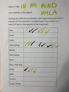
In order to get to the point of finalising my digipak we needed to complete masses amounts of research. We did this to make sure we completely understood the conventions of our genre so that our digipak was decoded (Hall) the right way by our target audience. We also made sure to research different fonts, colours and images to make sure our digipak was the same but different compared to other digipaks from our genre.

We changed some of the design due to past reflections and feedback.

  • Changed the back cover into black and white with pink text so that is was more uniform with the front cover, this meant that the front cover didn’t look out of place compared to the rest of the digipak
  • We changed the inside pages – took out the three edited eyes to make the digipak simpler and just put our artists name. We also added the albums name round the boarder of the right inside page
  • Made the signature bigger on the front cover and added the signature on the back cover.

Digipak Draft 3

Above is a slideshow displaying our draft 3 of our digipak. We have printed out our design and placed them inside the digipak case to get a better idea what our final product will look like. We then placed it with a sheet of paper which has a list of 12 different genres. Below is our sheet that people ticked.

This exercise was helpful for us as a group to see if we had encoded the correct conventions and representation of our star image (Dyer). From the results it is evident that we have designed our digipak in the right way as people as a majority guessed the right genre just from looking at our digipak. All three genres that were selected by our peers were correct as our genre is dance/pop. Some people thought that our genre was either just EDM or Pop which is also okay as our genre is a mix of both. I also believe that our branding represented our mission statement well as we clarified that the album would be like a typical dance music album with her own spin on it which is exactly what we have done. Our digipak is, on a whole, conventional for our genre but I think the front cover being so basic and simple it makes it her own rather than being like every other dance/pop artist.

Teacher Feedback – Screencastify

Our teacher has completed a screencastify of our draft 2 digipak. From listening to this feedback it has helped us realise what works and what doesn’t. Our teacher first mentioned that our front cover image is slightly ‘scary’ which is something that we did not aim for nor is it relevant for our genre. Because of this we are going to need to change either the editing of the front cover image or change the whole image completely so that people can decode from the front cover what genre our digipak is. Our teacher also mentioned that our spine was not done correctly as it needs to be the same on each side of the spine but placed the opposite way round to what we had originally done so that it goes up one way and back down the other. She spoke about how the editing on the left hand side image was arguably better than our front cover and she suggested using that editing style for the from cover rather than what we currently have. The fonts we have used are accurate but she has suggested that we make the track list a larger font size so it is easier to read and stands out more, along with this she spoke about the back cover image being too dark so we need to take it into photoshop to lighten it up. Throughout the screencastify it was obvious there were a few errors like line spacing and centerings titles etc. A suggestion which I think is something we should really consider as a group is adding lyrics in a circle or just some words relating to our star going round in a circle on the right hand side page inside the digipak.

Targets 

  • Lighting on the back cover image – make it brighter
  • Make the front cover more appealing to the audience
  • Re-consider what star image we want the audience to decode making sure we have encoded the correct feeling
  • Refine the editing throughout the entire digipak
  • Make some text bigger to grab attention
  • Add something exciting for the inside pages, behind the disc especially

Focus Forward 

This feedback has been extremely helpful and has made me see the silly errors and mistakes which can easily be fixed. This has also helped me notice that we are not displaying the correct star image based off the front cover which could be a problem as our target audience could reject our digipak. We will take our images back into adobe photoshop and Indesign to make sure we edit them in the correct way, making our digipak as conventional and successful as possible.

Digipak Draft 2

We have created draft 2 of our digipak including the insides and spine.

Front Cover 

Inside Pages 

Back Cover (including spines)

Reflection

We have changed the images we have used as we did another shoot which is more appropriate for our genre. For this draft we have made sure to make the colour scheme more conventional for our genre and change the adjustment of the track list. We have also changed the name of our album as we feel it suits our artist and genre better. For the inside we need to change the editing to make it look flawless and more like the rest of our digipak. We want to make sure our digipak is interesting but not too much for our audience.

Focus Forward 

We still need to change the insides of our digipak but I think the images chosen work well In order to make our digipak as successful as possible, our teacher is going to complete a screencastify to get more feedback to make it better.

Digipak Draft 1

Above is our first draft of our digipak. We have only created the front and back cover as we needed to do another photoshoot for the inside of the digipak. To help us with completing the rest of our digipak I have completed a self assessment so we can see what we need to improve on.

Below is the self assessment I have completed, identifying what we have done well and what we need to do for our second draft.

Doing this has helped us realise what else we need to add and if we need to use different images to fit our genre and convey our star image. We have discussed the colour pallet and we think we will change the back cover to an image for the images we have with the purple sunset lamp lighting rather than the orange as that is more conventional for our dance/pop genre.

Production Meeting For Photoshoot 2

We have decided to do a re shoot of our first shoot and plan a new shoot for the front of our digipak. Because of this we have created a new production meeting adgenda where we have discussed using a digital camera for the front cover image. We are going to use some accessories and make the hair look different to normal to make the images look interesting and conventional for our genre.

Shoot 1 Evaluation with Contact Sheets

Reflection –

Above is two contact sheets from out first photoshoot. I think this shoot was successful as it looks similar to our inspiration photos from our shoot plan and will work well for our genre. We planned to take these images for the back cover of our digipak as it is simple and will give us enough room to place the list of tracks. The last two images (purple/blue lighting) could potentially be used for the inside of the digipak behind the CD. We have chosen to use the sunset lamp as we feel it conveys the right genre of dance/pop. When we do our other shoot we will make sure the mice-en-scene matches our genre as this shoot did not require a specific costume as it is just her silhouette. We make sure to capture our model from a long shot so that we could get a whole body outline silhouette. With this being said, I feel as though the images on the second slide are less successful due to the colour of the sunset lamp and the poses of our model. Although they could still be used I do think that the images on the first slide are more appropriate and accurate for what we want for our digipak.

Below the contact sheets I have chosen my two favorite images from this shoot. The first image I have chosen without our star in it would be a good image for our digipak as it matches our planned colour pallet and gives the right idea for our genre. The second image is also one of my favourites as the silhouette looks good and our model is posing well. She is also not in the centre of the frame which is ideal as we would use this image as the a back cover of the digipak and we can add the tracks and other information to the right hand side of the back cover.

Focus Forward –

We now need to complete our next shoot in order to achieve the perfect front cover and make sure we have an appropriate image for the first side of the inside. We will make sure to take a variety of images from different angles and costumes to make sure we have a wide range of images to choose from.